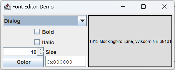
On this page we will continue are GUI development with the FontEditor class. Similar to the ColorEditor, an object of this class consists of a collection of interactive components that can be used to specify the properties of a font, and the related text color property. These components can be obtained individually and arranged in a GUI however the programmer wishes. There is also an option to get a ready-made JPanel containing the components in a default configuration. The individual components are:
- NameCombo: a JComboBox<String> containing a list of all supported font names (limited, at least for now, to Java’s logical font names).
- BoldToggle: a JCheckBox which, when selected, indicates that the font should be bold.
- ItalicToggle: a JCheckBox which, when selected, indicates that the font should be italic.
- SizeEditor: a JSpinner used to set the font size.
- ColorEditor: a ColorEditor object that can be used to set the desired text color. The color button and text editor components from this object are used.
- FeedbackWindow: a JLabel used to display a sample string in the selected font and text color.
GitHub repository: Cartesian Plane Part 15
Previous lesson: Cartesian Plane Lesson 15 Page 6: Testing the ColorEditor Class
The Font Editor
We’ll begin our discussion of the FontEditor with a discussion of two new Swing components, the JComboBox and JSpinner.
🔳About JComboBoxes
A JComboBox encapsulates a drop-down list. This is a kind of list from which one of many items may be selected. Normally only the selected item is shown in the GUI. However the operator may temporarily open the list and select a new item, at which time the list will close up again.
JComboBox is a parameterized type; the parameter indicates the type of object stored in the list. You should always declare a parameter when creating a combo box: JComboBox<String> strComboBox = new JComboBox<>();
JComboBox<Integer> intComboBox = new JComboBox<>();
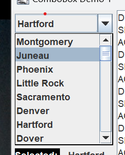
JComboBox has several constructors, including the default constructor and a constructor that takes an array of type E, where E is the type of the parameter. The latter is used in application JComboBoxDemo1, in the project sandbox:
public class JComboBoxDemo1
{
    private static final String     endl        = System.lineSeparator();
    private static final String[]   items       =
    {
        "Montgomery",     "Juneau",       "Phoenix",    "Little Rock",
        "Sacramento",     "Denver",       "Hartford",   "Dover",
        ...
    };
    private JComboBox<String> comboBox;
    ...
    public void makeGUI()
    {
        comboBox  = new JComboBox<>( items );
        ...
After instantiation new items can be added, inserted or deleted:
- JComboBox.addItem(E item): add an item at the end of the list.
- JComboBox.insertItemAt(E item, int index): add an item at a given index.
- JComboBox.removeAllItems(): remove all items from the combo box.
- JComboBox.removeItem(Object item): remove a specific item from the combo box.
- JComboBox.removeItemAt(int index): remove the item at the given index.
Each time an item is selected or deselected in the list, the combo box propagates an ItemEvent which you can catch with an ItemListener. The following is from JComboBoxDemo1:
...
/** Combo box being demonstrated. */
private JComboBox<String> comboBox;
/** Feedback window; updated every time an ActionEvent fires. */
private JLabel      actionFB;
/** Feedback window; updated every time an Item fires. */
private JLabel      selectedFB;
/** Feedback window; updated every time an Item fires. */
private JLabel      deselectedFB;
    ...
    comboBox.addItemListener( this::logStateChange );
    ...
private void logStateChange( ItemEvent evt )
{
    String  state   = null;
    Object  item    = evt.getItem();
    if ( evt.getStateChange() == ItemEvent.SELECTED )
    {
        state = "SELECTED: ";
        selectedFB.setText( item.toString() );
    }
    else
    {
        state = "DESELECTED: ";
        deselectedFB.setText( item.toString() );
    }

    String  msg     = state + item;
    appendToLog( msg );
}
In addition to ItemEvents, every time an item is selected the combo box will issue an ActionEvent, which you can catch with an ActionListener. This is usually more convenient than an ItemListener because it is only notified for selected items. Again from JComboBoxDemo1:
    comboBox.addActionListener( e -> {
        String  selectedItem = getSelectedItem();
        actionFB.setText( selectedItem );
        appendToLog( "ACTION: " + selectedItem );
    });
At any time you can ask the combo box for the currently selected item:
    JButton commit  = new JButton( "Commit" );
    JButton exit    = new JButton( "Exit" );
    commit.addActionListener( e ->
        appendToLog( "COMMITTED: " + getSelectedItem() )
    );
    ...
private String getSelectedItem()
{
    return (String)comboBox.getSelectedItem();
}
Note: getSelectedItem returns type Object, so the return value usually has to be cast. I wrote the above one-line method purely to avoid lines of code like: e -> actionFB.setText( (String)comboBox.getSelectedItem() )
■ Editable Combo Boxes
Optionally, a JComboBox can be editable; you accomplish this by setting the box’s editable property to true: comboBox.setEditable( true );
In our project, we’ll be using the non-editable flavor, but here’s a quick look at the editable version.
When a combo box is editable, the face of the box is replaced with a text box. The currently selected item is shown in the text box, and can be edited by the operator.
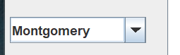

The code to create an editable combo box is shown in JComboBoxDemo2 in the project sandbox. Note that editing the value in the text box does not change the encapsulated list. To see this:
- Start JComboBoxDemo2.
- Open the drop-down list and select “Phoenix”.
- Change “Phoenix” to “Phobos”.
- Type the enter key.
- Observe the following:
- “Phobos” is logged as selected.
- “Phoenix” is still in the list, its spelling unchanged.
- “Phobos” is not in the list.
For additional information, see the How to Use Combo Boxes, in the Oracle Java tutorial.
⬛ About JSpinners
A spinner is a component used to traverse a sequence, either forward or backward. The spinner cycles as necessary: when moving forward, the item “after” the last item in the sequence is the first item in the sequence; when moving backward, the item “before” the first item in the sequence is the last. A JSpinner consists of a text field and two buttons; the buttons move the selected item to the next or previous item in the sequence.
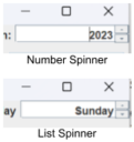
A JSpinner is always associated with a SpinnerModel which controls the spinner. Java makes three pre-built models available: SpinnerNumberModel, SpinnerListModel and SpinnerDateModel. The default is SpinnerNumberModel. Application JSpinnerDemo1 from the project sandbox shows how to create a number spinner:
    int                 currYear    = LocalDate.now().getYear();
    int                 maxYear     = currYear + 25;
    SpinnerNumberModel  yearModel   =
        new SpinnerNumberModel(
            currYear, // initial value of spinner
            currYear, // minimum value in sequence
            maxYear,  // maximum value in sequence
            1         // increment when pushing forward/back buttons
        );
    spinner = new JSpinner( yearModel );
First, create the SpinnerNumberModel. In doing so, you specify the initial value of the spinner, the minimum value in the sequence and the maximum value in the sequence. You also use these constructors:
- SpinnerNumberModel()
Creates a spinner with no minimum or maximum, a step value of 1 and an initial value of 0. - SpinnerNumberModel(double init, double min, double max, double step )
Same as SpinnerNumberModel(int, int, int, int), but values are treated as decimal. - SpinnerNumberModel(Number init, Number min, Number max, Number step )
Creates a spinner that can operate in integer or decimal modes.
If you run the demo, you’ll see that the operator can edit the text box directly. The operator’s entry is not evaluated until the operator pushes the enter key, or the programmer calls the commitEdit method. For this reason, before attempting to obtain the value of the spinner, you should first call commit, which may throw a ParseException. For an example, see the code from JSpinnerDemo1:
private void selectCallback( ActionEvent evt )
{
    try
    {
        spinner.commitEdit();
        int year    = (int)spinner.getValue();
        selected.setText( "Best by " + year );
    }
    catch ( ParseException exc )
    {
        selected.setText( "#ERROR" );
    }
}
Note: I have never been able to get commitEdit to throw an exception of any kind. If I enter an invalid value in the text box the spinner just reverts to the most recently selected value. I asked about this on StackOverflow and the only response I got said, to paraphrase, “yeah, you’re never going to get an exception.” Which causes me great anxiety, because it means I have a block of code that will never get test coverage.
JSpinnerDemo2 from the project sandbox shows how to create a spinner that works with a list of Objects, using SpinnerListModel. The constructor for this model takes an array of objects that becomes the spinner’s list:
private static final    String[]    daysOfWeek  =
{ "Sunday",   "Monday", "Tuesday", "Wednesday",
  "Thursday", "Friday", "Saturday"
};

SpinnerListModel dayModel = new SpinnerListModel( daysOfWeek );
spinner = new JSpinner( dayModel );
The spinner cycles through the objects in the list pretty much the same way the number spinner in JSpinnerDemo1 cycles through integers. The operator can edit the currently selected list item, but can only specify items in the list. In JSpinnerDemo2, for example, if I try to enter “Jueves”, the spinner will just replace it with “Sunday”.
JSpinners are also associated with editor objects, that attempt to deal with formatted fields of specific types. Java provides the following editors:
- JSpinner.DefaultEditor provides a generic, non-editable JFormattedTextField for displaying the current value. If, in JSpinnerDemo1, I want to prevent the operator from directly editing the value of the spinner, I could use:
spinner.setEditor( new JSpinner.DefaultEditor( spinner ) ); - JSpinner.NumberEditor provides a JFormattedTextField that can be used to edit numbers. This class has a constructor that tells it how to format the numbers it displays. In JSpinnerDemo1 the default NumberEditor display years as “2,023”. To get rid of the comma separator, I used:
    JSpinner.NumberEditor editor =
        new JSpinner.NumberEditor( spinner, "0000" );
spinner.setEditor( editor ); - JSpinner.ListEditor is used for editing lists of objects; and
- JSpinner.DateEditor is used for working with dates. Unfortunately, this editor works with the old Date and Calendar classes, and not with the newer java.time classes.
If you’re confident and feeling bold, you can always write your own spinner model and/or editor; see the documentation for:
- Interface SpinnerModel
- Class AbstractSpinnerModel
- Class JSpinner.DefaultEditor
For more information, see How to Use Spinners on the Oracle Java tutorial website.
⬛ class FontEditor
Like the ColorEditor, the FontEditor encapsulates a set of components designed to work together to specify the properties of a font. The components can be obtained individually, for incorporation into a user’s GUI, or organized into a default GUI configuration based on a JPanel. The individual components are:
- A JComboBox for selecting the font name;
- A JCheckBox to indicate whether or not the font is bold;
- A JCheckBox to indicate whether or not the font is italic;
- A JSpinner for setting the font size;
- A JButton for posting a ColorSelector (this component comes from an embedded ColorEditor);
- A JTextfield for formulating a color as an integer (this component comes from an embedded ColorEditor); and
- A JLabel constituting the feedback window.
Here are some notes on the initialization logic for a FontEditor object.
1 2 3 4 5 6 7 8 9 10 11 12 13 14 15 16 17 18 19 20 21 22 23 24 25 26 27 28 29 30 31 32 33 34 35 36 37 38 39 40 41 42 43 44 45 46 | public class FontEditor { private static final String sampleString = "<html>1313 Mockingbird Lane, Wisdom NB 68101</html>"; private static final String errorString = "--ERROR--"; private static final Font errorFont = new Font( Font.DIALOG, Font.ITALIC, 12 ); private static final Color errorColor = Color.BLACK; private static final String[] fontNames = { Font.DIALOG, Font.DIALOG_INPUT, Font.MONOSPACED, Font.SANS_SERIF, Font.SERIF }; private final JComboBox<String> fontList = new JComboBox<>( fontNames ); private final JCheckBox boldToggle = new JCheckBox( "Bold" ); private final JCheckBox italicToggle = new JCheckBox( "Italic" ); private final SpinnerNumberModel sizeModel = new SpinnerNumberModel( 10, 1, 40, 1 ); private final JSpinner sizeEditor = new JSpinner( sizeModel ); private final ColorEditor colorEditor = new ColorEditor(); private final Feedback feedback = new Feedback( sampleString ); public FontEditor() { boldToggle.addActionListener( e -> feedback.update() ); italicToggle.addActionListener( e -> feedback.update() ); fontList.addActionListener( e -> feedback.update() ); colorEditor.addActionListener( e -> feedback.update() ); sizeEditor.addChangeListener( e -> feedback.update() ); feedback.update(); } ... } |
- Lines 3,4*: The string to display in the feedback window. We’re asking Java to treat it as HTML so that it will span multiple lines when the font size grows.
- Lines 6-9: The string, font and text color to display in the feedback window, should either the font size or text color not be configured correctly.
- Lines 11-18: The font names to be listed in the JComboBox.
- Lines 19-24: the JComboBox to hold the font names, and the toggle buttons for the bold and italic properties.
- Lines 25,26: The spinner model with which to create the JSpinner that controls the font size. It’s specifically a SpinnerNumberModel with:
- An initial value of 10;
- A minimum value of 1;
- A maximum value of 40; and
- A step of 1.
- Lines 27,28: The spinner for selecting the font size.
- Lines 29,30: The ColorEditor used to select the text color. This component contains the color button (type JButton) and color text box (type JTextField) which are an integral part of the FontEditor GUI.
- Lines 32,33: The feedback window that displays the sample text in the selected font and text color. (Feedback is an inner class that extends JLabel; see below.)
- Lines 35-44: Constructor.
- Lines 37-41: Adds listeners to the embedded components that will update the feedback window when a value changes.
- Line 43: Performs initial configuration of the feedback window.
*Note: In Java, You can do all sorts of interesting things with HTML, sometimes even with CSS. Try this in a program:
private static final String labelText =
"<html>"
+ "<span style='color: red;'>Little miss </span>"
+ "<span style='color: green; font-size: 200%;'>"
+ " Stuffit"
+ "</span><br>"
+ "<span style='color: blue;'>sat on </span>"
+ "<span style='color: #7f00ff; "
+ "font-size: 200%; font-family: arial bold'>"
+ "a Muppet"
+ "</span>🤑"
+ "</html>";
...
JLable label = new JLabel( labelText );
See also:
- How to Use HTML in Swing Components In the Oracle Java Tutorial
- How to Use Editor Panes and Text Panes In the Oracle Java Tutorial
- The JEditorPane documentation page in the Oracle Java documentation
-
In the project sandbox:
- HTMLDemo1
- ActivityLog
- ActivityLogDemo
To obtain an internal component, the programmer calls one of these methods:
- getNameCombo()
- getBoldToggle()
- getItalicToggle()
- getSizeEditor() (the JSpinner)
- getColorEditor() (returns the embedded ColorEditor, containing both the JButton and JTextField for selecting the text color)
- getFeedback()
The feedback component is implemented via an inner class, Feedback, that extends JLabel. It has one constructor and one method. The constructor gives the label a neutral background so that most text colors can be easily observed; JLabels by default are transparent, so if we want to see the background we have to make it opaque: setOpaque( true );
It also gives itself a simple LineBorder. The update method updates the appearance of the window to reflect the current values stored in the FontEditor. Here’s the annotated code.
1 2 3 4 5 6 7 8 9 10 11 12 13 14 15 16 17 18 19 20 21 22 23 24 25 26 27 28 29 30 31 32 33 34 35 36 37 38 | private class Feedback extends JLabel { public Feedback( String text ) { super( text ); setForeground( colorEditor.getColor().orElse( Color.BLACK ) ); setOpaque( true ); setBackground( new Color( 0xDDDDDD ) ); Border border = BorderFactory.createLineBorder( Color.BLACK, 2 ); setBorder( border ); } public void update() { Optional<Font> optFont = getSelectedFont(); Optional<Color> optColor = colorEditor.getColor(); Font font = null; String text = null; Color color = null; if ( optFont.isPresent() && optColor.isPresent() ) { font = optFont.get(); color = optColor.get(); text = sampleString; } else { font = errorFont; text = errorString; color = errorColor; } setFont( font ); setForeground( color ); setText( text ); } } |
- Line 1: Make Feedback a Subclass of JLabel.
- Line 3: Constructor; text is the text to display on the label.
- Line 5: Passes text to the superclass constructor.
- Line 6: Sets the text color of the label. Recall that ColorEditor.getColor() returns an Optional<Color>, so this line of code sets the text color to the color stored in the ColorEditor object unless the color in the ColorEditor object is malformed, in which case the foreground is set to black.
- Line 7: Makes the label opaque. If this is not set to true, we won’t be able to see the background color set on line 8.
- Line 8: Sets the background color of the label to light gray.
- Lines 9-11: Gives the label a border.
- Line 14: The update method; this method is called each time a font property is updated. See the FontEditor Constructor, above.
- Line 16: Gets the current font. Method returns an Optional<Font>; see getSelectedFont, below.
- Line 17: Gets the current color from the ColorEditor.
- Lines 21-26: If the current font and the current color are both valid, initializes the font, color and text variables to their normal values.
- Lines 27-32: If the current font or the current color are invalid, initializes the font, color and text variables to error values.
- Lines 34-36: Sets the feedback window’s font, color and text to the values determined above.
Not surprisingly, the programmer can obtain the selected font from a FontEditor object. The method getSelectedFont returns an Optional that will contain a Font object if the font properties are correctly configured. The programmer can also interrogate the FontEditor object directly in order to obtain the values of the name, bold, italic, size and text color properties. To provide these values, the FontEditor object must interrogate the associated components. The getters are pretty straightforward; the only wrinkle is that the operator may have accidentally misconfigured the size or color, so the getters for these properties return Optionals that will be empty if necessary. The code for the getters follows.
1 2 3 4 5 6 7 8 9 10 11 12 13 14 15 16 17 18 19 20 21 22 23 24 25 26 27 28 29 30 31 32 33 34 35 36 37 38 39 40 41 42 43 44 45 46 47 48 49 50 51 52 53 54 55 56 57 58 59 60 61 62 63 64 | public Optional<Font> getSelectedFont() { Optional<Font> optFont = Optional.empty(); String fontName = (String)fontList.getSelectedItem(); int fontSize = 1; int fontStyle = 0; if ( boldToggle.isSelected() ) fontStyle |= Font.BOLD; if ( italicToggle.isSelected() ) fontStyle |= Font.ITALIC; try { sizeEditor.commitEdit(); fontSize = (int)sizeEditor.getValue(); Font font = new Font( fontName, fontStyle, fontSize ); optFont = Optional.of( font ); } catch ( ParseException exc ) { // ignore; return will default to Optional.empty() } return optFont; } public String getName() { String currFontName = (String)fontList.getSelectedItem(); return currFontName; } public OptionalInt getSize() { OptionalInt optSize = OptionalInt.empty(); try { sizeEditor.commitEdit(); int size = (int)sizeEditor.getValue(); optSize = OptionalInt.of( size ); } catch ( ParseException exc ) { } return optSize; } public boolean isBold() { boolean currIsBold = boldToggle.isSelected(); return currIsBold; } public boolean isItalic() { boolean currIsItalic = italicToggle.isSelected(); return currIsItalic; } public Optional<Color> getColor() { Optional<Color> optColor = colorEditor.getColor(); return optColor; } |
⬛ FontEditor Composition

The method getPanel returns a JPanel (the main panel) containing the default configuration of the constituent components. The JPanel has a GridLayout consisting of 1 row and two columns. The first column contains another JPanel (the left panel) containing the controls, and the second column contains the feedback window. This is the code that configures the main panel.
public JPanel getPanel()
{
    // GridLayout: 1 row, 2 columns, 3 pixels of space between
    // columns, 0 pixels of space between rows.
    JPanel  panel   = new JPanel( new GridLayout( 1, 2, 3, 0 ) );
    panel.add( getLeftPanel() );
    panel.add( feedback );

    return panel;
}
We’ve already seen the code to configure the feedback window (see above). The left panel is a JPanel with a GridLayout of five rows and one column, containing the following components:
- The font name combo box.
- The bold toggle button.
- The italic toggle button.
- A JPanel (the size panel) with a GridLayout of one row and two columns:
- The left column contains the spinner used to select the font size.
- The right column contains a JLabel.
- A JPanel (the color panel) with a GridLayout of one row and two columns:
- The left column contains a the color button (type JButton).
- The right column contains the JTextField used to edit the color.
The annotated code follows.
1 2 3 4 5 6 7 8 9 10 11 12 13 14 15 16 17 18 19 20 21 22 23 24 25 26 27 28 29 30 31 32 33 | private JPanel getLeftPanel() { JPanel panel = new JPanel(); panel.setLayout( new BoxLayout( panel, BoxLayout.Y_AXIS ) ); panel.add( fontList ); panel.add( boldToggle ); panel.add( italicToggle ); JLabel sizeLabel = new JLabel( "Size" ); sizeLabel.setAlignmentX( JComponent.CENTER_ALIGNMENT ); sizeEditor.setAlignmentX( JComponent.CENTER_ALIGNMENT ); JPanel sizePanel = new JPanel(); sizePanel.setLayout( new GridLayout( 1, 2, 3, 0 ) ); sizePanel.add( sizeEditor ); sizePanel.add( sizeLabel ); panel.add( sizePanel ); JPanel colorPanel = new JPanel(); colorPanel.setLayout( new GridLayout( 1, 2, 3, 0 ) ); colorPanel.add( colorEditor.getColorButton() ); colorPanel.add( colorEditor.getTextEditor() ); panel.add( colorPanel ); float align = JPanel.CENTER_ALIGNMENT; fontList.setAlignmentX( align ); boldToggle.setAlignmentX( align ); italicToggle.setAlignmentX( align ); sizePanel.setAlignmentX( align ); colorPanel.setAlignmentX( align ); return panel; } |
- Lines 3,4: Creates the left panel, giving it a vertical BoxLayout.
- Lines 5-7: Adds the combo box and toggle buttons to the left panel.
- Lines 9-11: Creates the size label; centers the size label and size editor (the JSpinner) horizontally.
- Lines 13,14: Creates the size panel with a GridLayout of one row and two columns, with three pixels of space between columns, and zero pixels of space between rows.
- Lines 15,16: Adds the size label and size editor to the size panel.
- Line 17: Adds the size panel to the left panel.
- Lines 19,20: Creates the color panel with a GridLayout of one row and two columns, with three pixels of space between columns, and zero pixels of space between rows.
- Lines 21,22: Adds the color button and color editor to the color panel.
- Line 23: Adds the color panel to the left panel.
- Lines 25-30: Horizontally centers the children of the left panel.