On this page we’re going to make some of our own components for use in the GUIs we create on later pages. The new components are intended to provide visual feedback about line characteristics: length, stroke (the width of a line) and spacing (for example, the distance between grid lines). You can see the feedback components in action if you run application FeedbackComponentDemo2 from the project sandbox. We’ll introduce the following new classes:
- abstract class Feedback extends JComponent
- class LengthFeedback extends Feedback
- class SpacingFeedback extends Feedback
- class StrokeFeedback extends Feedback
See also:
GitHub repository: Cartesian Plane Part 16
Previous lesson: Cartesian Plane Lesson 16 Page 3: Menus
Custom Components
Let’s start working on some custom components for our upcoming line properties dialog. These will be for providing feedback for:
- The length of a line, for example the line representing a major tic mark.
- Spacing between lines, for example between grid lines.
- Line stroke; the weight or width of a line.
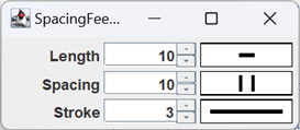
In the figure to the left, the rectangular components in the third column are examples of the feedback components. We’ll follow a similar strategy in designing each:
- We start with the abstract class Feedback, which will encapsulate some common features of the three concrete classes, such as the default background and foreground colors, and the border around a component.
- Each concrete component will subclass Feedback.
- Each subclass instance will be constructed with a DoubleSupplier; the supplier will be consulted each time the component is drawn, and will supply the value for the associated property.
- To draw the components we will override their PaintComponent methods.
- The background and foreground colors for each component will be managed by the JComponent superclass.
- The dimensions of each component will be managed by the superclass.
- Each will override the isOpaque() method in the JComponent superclass; we’ll talk about that below.
abstract class Feedback extends JComponent
This is a fairly simple class which encapsulates features common to its three concrete subclasses. These are:
- The default color of each component; note that, after establishing the defaults, these properties are the responsibility of the JComponent superclass.
- The default border of each component; note that, after establishing the default, this property is the responsibility of the JComponent superclass.
- The weight property, the width of a stroke used to compose lines used in the concrete components.
- Overriding isOpaque.
Note: If you read the documentation for the JComponent class you’ll find a note addressed to “Subclasses that guarantee to always completely paint their contents… .” The note says that such classes should override isOpaque with a method that always returns true.
Here are the fields and constructor for the feedback class:
1 2 3 4 5 6 7 8 9 10 11 12 13 14 15 16 17 | public abstract class Feedback extends JComponent { private static final Color defBackground = Color.WHITE; private static final Color defForeground = Color.BLACK; private static final float defWeight = 3; private float weight = defWeight; public Feedback() { setBackground( defBackground ); setForeground( defForeground ); setWeight( defWeight ); setBorder( BorderFactory.createLineBorder( Color.BLACK ) ); } // ... } |
The remainder of the class is composed of a setter and getter for the weight property, and the isOpaque method, which looks like this:
@Override
public boolean isOpaque()
{
    return true;
}
class LengthFeedback extends Feedback

We’ll look at the code for the LengthFeedback class in detail. As you’ll see, details for the other two classes are quite similar. Following is the annotated code for the fields and constructor.
1 2 3 4 5 6 7 8 9 10 11 12 13 | public class LengthFeedback extends Feedback { private final Line2D line = new Line2D.Double(); private final DoubleSupplier lengthSupplier; private Stroke stroke; public LengthFeedback( DoubleSupplier valueSource ) { super(); lengthSupplier = valueSource; } // ... } |
- Line 3: This field will be updated to the selected value in the paintComponent method; it is then used to draw the horizontal feedback line.
- Line 4: The supplier for the currently selected value of the length property. It is set in the constructor, and utilized in the paintComponent method.
- Line 5: Controls the weight of the horizontal feedback line. It is initialized in the constructor to the default, and updated every time the setWeight method is called.
- Line 7: Constructor; the valueSource parameter is the supplier for the currently selected value of the length property.
- Lines 10,11: Initializes lengthSupplier.
Note: The stroke field is initialized when the superclass calls the setWeight method.
In addition to the paintComponent method, the class overrides setWeight. Each time this method is called, it updates the stroke field, which controls the weight of the horizontal feedback line.
@Override
public void setWeight( float weight )
{
    super.setWeight( weight );
    stroke = new BasicStroke(
        weight,
        BasicStroke.CAP_BUTT,
        BasicStroke.JOIN_ROUND
    );
}
Finally, we have to override the paintComponent method, which will paint the background of the component and draw the horizontal feedback line. The code and notes follow.
1 2 3 4 5 6 7 8 9 10 11 12 13 14 15 16 17 18 19 20 | public void paintComponent( Graphics graphics ) { super.paintComponent( graphics ); Graphics2D gtx = (Graphics2D)graphics.create(); int width = getWidth(); int height = getHeight(); double length = lengthSupplier.getAsDouble(); double xco1 = (width - length) / 2; double xco2 = xco1 + length; double yco = height / 2; gtx.setColor( getBackground() ); gtx.fillRect( 0, 0, width, height ); gtx.setColor( getForeground() ); gtx.setStroke( stroke ); line.setLine( xco1, yco, xco2, yco ); gtx.draw( line ); gtx.dispose(); } |
- Line 3: Invokes the paintComponent method in the superclass. As a rule this should be the first thing you do when you override this method.
- Line 4: Creates a temporary copy of the graphics context. Recall that if you change the value of a field in the original graphics context, you have to remember to save its original value, and restore it at the end of the method. By creating and manipulating a copy we eliminate the need for the save/restore logic. Note that we go to the trouble of disposing the temporary copy at the end of the method (line 19).
- Lines 5,6: Gets the current width and height of the component.
- Line 7: Obtains the currently selected value of the length property.
- Lines 8,9: Calculates the beginning and ending x-coordinates of the feedback line so that it is horizontally centered in the component.
- Line 10: Calculates the y-coordinated of the feedback line so that it is vertically centered in the component.
- Lines 12,13: Fills the component with the background color.
- Lines 15,16: Sets the color and weight of the horizontal feedback line.
- Line 17: Sets the coordinates of the horizontal feedback line in the Line2D field.
- Line 18: Draws the horizontal feedback line.
- Line 19: Disposes the temporary copy of the graphics context. This isn’t strictly necessary, but it improves the performance of garbage collection.
class SpacingFeedback extends Feedback

The SpacingFeedback component has all the same fields as the LengthFeedback component, with two exceptions: instead of a Line2D field for a horizontal line, it has two Line2D fields for the vertical lines drawn by the paintComponent method: private final Line2D left = new Line2D.Double();
private final Line2D right = new Line2D.Double();
and it has a field to determine what proportion of the height of the component should be occupied by the two vertical lines: private static final float percentHeight = .5f;
The constructor and the setWeight method are identical to those of LengthFeedback. The annotated code for the paintComponent method follows.
1 2 3 4 5 6 7 8 9 10 11 12 13 14 15 16 17 18 19 20 21 22 23 24 25 26 | public void paintComponent( Graphics graphics ) { super.paintComponent( graphics ); Graphics2D gtx = (Graphics2D)graphics.create(); int width = getWidth(); int height = getHeight(); double centerXco = width / 2.; double centerYco = height / 2.; double yOffset = (height * percentHeight) / 2.; double xOffset = spacingSupplier.getAsDouble() / 2.; double xcoLeft = centerXco - xOffset; double xcoRight = centerXco + xOffset; double ycoTop = centerYco - yOffset; double ycoBottom = centerYco + yOffset; gtx.setColor( getBackground() ); gtx.fillRect( 0, 0, width, height ); gtx.setColor( getForeground() ); gtx.setStroke( stroke ); left.setLine( xcoLeft, ycoTop, xcoLeft, ycoBottom ); right.setLine( xcoRight, ycoTop, xcoRight, ycoBottom ); gtx.draw( left ); gtx.draw( right ); gtx.dispose(); } |
- Lines 3-6: Invokes paintComponent in the superclass, makes a temporary copy of the graphics context and gets the current dimensions of the component; this is identical to the corresponding code in the LengthFeedback paintComponent method.
- Lines 7,8: Calculates the center point of the component.
- Line 9: a) Calculates the total height of the two vertical feedback lines, and b) divides by 2 to get the offset above and below the component’s center point for calculating the y coordinates of the feedback lines.
- Line 10: a) gets the currently selected value of the spacing property; and b) divides by 2 to get the offset to the left and right of the component’s center point for calculating the x coordinates of the feedback lines.
- Lines 11-14: Calculates the x- and y-coordinates of the two vertical feedback lines.
- Lines 16,17: Paints the component’s background.
- Lines 19,20: Sets the color and stroke for drawing the vertical feedback lines.
- Lines 21,22: Establishes the coordinates of the vertical feedback lines.
- Lines 23,24: Draws the vertical feedback lines.
- Line 25: Disposes the temporary graphics context.
class StrokeFeedback extends Feedback

The differences in the fields between this class and LengthFeedback are:
- The weight of the line is set from the current value of the stroke property, so there is no independent property that determines the weight of the horizontal feedback line. The setWeight method is overridden to ensure that the value of the weight property is always -1.
- It has a field to determine what proportion of the width of the component should be occupied by the horizontal feedback line:
private static final float percentWidth = .75f;
The constructor is little different from the other two custom components. The overridden setWeight method is quite simple:
@Override
public void setWeight( float weight )
{
    super.setWeight( -1 );
}
You can see the paintComponent method below, followed by an abbreviated description.
1 2 3 4 5 6 7 8 9 10 11 12 13 14 15 16 17 18 19 20 21 22 23 | public void paintComponent( Graphics graphics ) { super.paintComponent( graphics ); Graphics2D gtx = (Graphics2D)graphics.create(); int width = getWidth(); int height = getHeight(); double weight = weightSupplier.getAsDouble(); double centerXco = width / 2d; double yco = height / 2d; double xcoOffset = (width * percentWidth) / 2d; double xco1 = centerXco - xcoOffset; double xco2 = centerXco + xcoOffset; gtx.setColor( getBackground() ); gtx.fillRect( 0, 0, width, height ); Stroke stroke = new BasicStroke( (float)weight ); gtx.setColor( getForeground() ); gtx.setStroke( stroke ); line.setLine( xco1, yco, xco2, yco ); gtx.draw( line ); gtx.dispose(); } |
- Lines 8,9: Calculates the coordinates of the center of the component.
- Line 10: a) Calculates the total width of the component that the horizontal feedback line is to occupy; b) divides by 2 to get the offset from the center point for the left and right endpoints of the feedback line.
- Lines 11,12: Calculates the x-coordinates of the endpoints of the feedback line.
- Line 20: Establishes the coordinates of the feedback line.
class LengthFeedbackDemo1
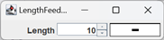
There are separate demos in the project sandbox showing how to configure each of the custom components. Let’s look at the code and a few notes for LengthFeedbackDemo1:
1 2 3 4 5 6 7 8 9 10 11 12 13 14 15 16 17 18 19 20 21 22 23 24 25 26 27 28 29 30 31 32 33 34 35 36 37 | public class LengthFeedbackDemo1 { private final SpinnerNumberModel numberModel = new SpinnerNumberModel( 10, 0, 1000, 1 ); private final JSpinner spinner = new JSpinner( numberModel ); public static void main(String[] args) { SwingUtilities.invokeLater( () -> new LengthFeedbackDemo1() ); } public LengthFeedbackDemo1() { JFrame frame = new JFrame( "LengthFeedback Demo 1" ); frame.setDefaultCloseOperation( JFrame.EXIT_ON_CLOSE ); JPanel contentPane = new JPanel( new GridLayout( 1, 3, 3, 3 ) ); JLabel label = new JLabel( "Length", SwingConstants.RIGHT ); LengthFeedback lengthFB = new LengthFeedback( () -> numberModel.getNumber().doubleValue() ); spinner.addChangeListener( e -> lengthFB.repaint() ); Border emptyBorder = BorderFactory.createEmptyBorder( 5, 5, 5, 5 ); contentPane.setBorder( emptyBorder ); contentPane.add( label ); contentPane.add( spinner ); contentPane.add( lengthFB ); frame.setContentPane( contentPane ); frame.pack(); frame.setVisible( true ); } } |
- Lines 3-6: Creates a spinner which is used to set the desired length of a line.
- Lines 18,19: Creates a content pane with a GridLayout of 1 row and 3 columns (the last two arguments are the horizontal and vertical spacing). Recall that the GridLayout manager will get the preferred size of all components in the JPanel, and set the actual size of each component to the largest width and height needed. In this example this is how the LengthFeedback component gets its width and height; in other cases sizing the component may not be quite so straightforward. See LengthFeedbackDemo2, below, for a discussion.
- Lines 22-24: Creates the LengthFeedback component. The DoubleSupplier argument:
- Goes to the spinner’s model; note that this is a SpinnerNumberModel, which always treats the encapsulated value as numeric data.
- Calls the spinner model’s getNumber method which returns the encapsulated value as a Number object1.
- Calls the Number object’s doubleValue method, which returns the encapsulated value as type double.
- Line 25: Adds a change listener to the spinner. The listener will be activated every time the spinner’s value changes, which will invoke the LengthFeedback component’s repaint method. The repaint method will cause the component’s paintComonent method to be called, which will obtain the new value from it’s DoubleSupplier (the spinner’s number model) and redraw the component with the new value.
1Number is the superclass for Integer, Double and all the other numeric primitive wrapper classes, as well as a handful of other classes that encapsulate numeric values.
class LengthFeedbackDemo2
As mentioned above, giving a size to one of the Feedback components is not always straightforward. LengthFeedbackDemo1 placed a LengthFeedback component in a content pane with a GridLayout, and the GridLayout calculated a size for it. LengthFeedbackDemo2 uses a FlowLayout, which just lays out children as best it can based on their preferred size. A Feedback component has a preferred size of width=0 and height=0, so unless we explicitly set its size we won’t be able to see it. Setting the width is relatively simple; in LengthFeedbackDemo2 we just set it to 100 pixels. But how do we choose a height so that it more-or-less matches the other components in the layout?
LengthFeedbackDemo2 accomplishes this by getting the height of the “Length” label that precedes the Feedback component, and using that. Here’s the code that does that:
public LengthFeedbackDemo2()
{
    JFrame          frame       = new JFrame( "LengthFeedback Demo 2" );
    frame.setDefaultCloseOperation( JFrame.EXIT_ON_CLOSE );
    JPanel          contentPane = new JPanel();
    JLabel          label       =
        new JLabel( "Length", SwingConstants.RIGHT );
    LengthFeedback  lengthFB    =
        new LengthFeedback( () ->
            numberModel.getNumber().doubleValue()
        );
    spinner.addChangeListener( e -> lengthFB.repaint() );

    // Give the LengthFeedback component an explicit width of 100,
    // and the same height as the preceding label.
    Dimension   prefSize    = label.getPreferredSize();
    prefSize.width = 100;
    lengthFB.setPreferredSize( prefSize );
    // ...
}
Using Other DoubleSuppliers
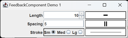
So far, all of the sandbox demos for LengthFeedback, SpacingFeedback and StrokeFeedback used spinners to select line properties, and pass the property value along to the associated feedback component. But the Feedback components just need a Supplier to work, so they’re potentially much more versatile than that. FeedbackDemo1 from the project sandbox demonstrates the use of three different Suppliers; it uses a spinner to select the length property, a text box to select the spacing property and a ButtonGroup to select the stroke property value. Here’s the relevant code accompanies by a few notes.
1 2 3 4 5 6 7 8 9 10 11 12 13 14 15 16 17 18 19 20 21 22 23 24 25 26 27 28 29 30 31 32 33 34 35 36 37 38 39 40 41 42 43 44 45 46 47 48 49 50 51 52 53 54 55 56 57 58 59 60 61 62 63 64 65 66 67 68 69 70 71 72 73 74 75 76 77 78 79 80 81 82 83 84 85 86 87 88 89 90 91 92 93 94 95 96 97 98 99 100 101 102 103 104 105 106 107 | public class FeedbackComponentDemo1 { private final SpinnerNumberModel lengthModel = new SpinnerNumberModel( 10, 0, 1000, 1 ); private final JSpinner lengthControl = new JSpinner( lengthModel ); private final JTextField spacingControl = new JTextField( "5", 10 ); private final PButtonGroup<Double> strokeControl = new PButtonGroup<>(); //... public FeedbackComponentDemo1() { JFrame frame = new JFrame( "FeedbackComponent Demo 1" ); frame.setDefaultCloseOperation( JFrame.EXIT_ON_CLOSE ); JPanel contentPane = new JPanel( new GridLayout( 3, 3, 3, 3 ) ); JLabel lengthLabel = new JLabel( "Length", SwingConstants.RIGHT ); LengthFeedback lengthFB = new LengthFeedback( () -> lengthModel.getNumber().doubleValue() ); lengthControl.addChangeListener( e -> lengthFB.repaint() ); contentPane.add( lengthLabel ); contentPane.add( lengthControl ); contentPane.add( lengthFB ); JLabel spacingLabel = new JLabel( "Spacing", SwingConstants.RIGHT ); SpacingFeedback spacingFB = new SpacingFeedback( () -> parseTextControl() ); spacingControl.addActionListener( e -> spacingFB.repaint() ); contentPane.add( spacingLabel ); contentPane.add( spacingControl ); contentPane.add( spacingFB ); JPanel strokePanel = getStrokePanel(); JLabel strokeLabel = new JLabel( "Stroke", SwingConstants.RIGHT ); StrokeFeedback strokeFB = new StrokeFeedback( () -> strokeControl.getSelectedProperty() ); strokeControl.getButtons().stream() .forEach( b -> b.addActionListener( e -> strokeFB.repaint() ) ); strokeControl.selectIndex( 0 ); contentPane.add( strokeLabel ); contentPane.add( strokePanel ); contentPane.add( strokeFB ); Border emptyBorder = BorderFactory.createEmptyBorder( 5, 5, 5, 5 ); contentPane.setBorder( emptyBorder ); frame.setContentPane( contentPane ); frame.pack(); frame.setVisible( true ); } private JPanel getStrokePanel() { PRadioButton<Double> small = new PRadioButton<>( 1. ); PRadioButton<Double> medium = new PRadioButton<>( 5. ); PRadioButton<Double> large = new PRadioButton<>( 10. ); strokeControl.add( small ); strokeControl.add( medium ); strokeControl.add( large ); JPanel panel = new JPanel(); BoxLayout layout = new BoxLayout( panel, BoxLayout.X_AXIS ); Border border = BorderFactory.createLineBorder( Color.BLACK ); panel.setBorder( border ); panel.setLayout( layout ); panel.add( new JLabel( "Sm", SwingConstants.RIGHT ) ); panel.add( small ); panel.add( new JLabel( "Med", SwingConstants.RIGHT ) ); panel.add( medium ); panel.add( new JLabel( "Lg", SwingConstants.RIGHT ) ); panel.add( large ); return panel; } private double parseTextControl() { double value = 1; try { String text = spacingControl.getText(); value = Double.parseDouble( text ); } catch ( NumberFormatException exc ) { spacingControl.setText( "##Error##"); } return value; } } |
- Lines 3-6: The spinner that controls line length.
- Lines 8,9: The text box that controls spacing.
- Lines 11,12: The ButtonGroup that controls the stroke.
- Lines 25,26: Creates a LengthFeedback component with a Supplier that obtains its value from the spinner (line 3).
- Line 28: Adds a ChangeListener to the spinner that will cause the LengthFeedback component to be updated every time the spinner changes.
- Lines 35,36: Creates a SpacingFeedback component. Its Supplier is the method parseTextContol (line 92).
- Line 38: Adds an ActionListener to the text box that will update the SpacingFeedback component any time the operator types enter in the text box.
- Line 43: Gets a panel (line 67) that contains three PRadioButtons managed by the strokeControl button group.
- Lines 46-48: Creates a StrokeFeedback component whose supplier is the getSelectedProperty method of the strokeControl button group.
- Lines 49-53: Adds an ActionListener to each button in the strokeControl button group that will update the StrokeFeedback component every time a new button is selected.
- Line 54: Selects the first button in the strokeControl button group.
- Lines 67-90: The method that creates the panel containing the radio buttons.
- Lines 69-74: Creates three PRadionButton<Double> objects with property values of 1, 5 and 10; adds the radio buttons to the strokeControl button group.
- Lines 92-106: Method to parse the text from the text box that controls the spacing property, and return the value as type double. If the parse operation fails, sets the text in the text box to “Error”, and returns 0.
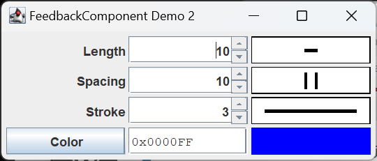
All Feedback Components
One more picture: there’s another feedback component that we made earlier, as part of the ColorEditor class. Color is a property of lines that we will want to control as part of the LineProperties dialog, and I wanted to see how well the ColorEditor would fit in with our new Feedback components. The result is FeedbackDemo2, in the project sandbox. Here’s a picture of what it produces; you can find the code in the GitHub repository.
Summary
On this page we created three custom controls for displaying feedback about a selected line property: LengthFeedback, SpacingFeedback and StrokeFeedback. On the next few pages we’ll develop JUnit tests for them, and, in the process, introduce a new GUI testing technique.