Our goal for this page is to assemble a JPanel containing a GUI for managing the properties of lines as discussed on the previous page. For the moment we’re going to concentrate on the GUI alone: what components it contains, how they are supposed to work, and how the GUI is laid out. The logic for how it is made to work (e.g., the event processing logic) is saved for a later page; in other words, when we’re done with this page, we’ll be able to display the GUI, but it won’t be fully functional.
GitHub repository: Cartesian Plane Part 16
Previous lesson: Cartesian Plane Lesson 16 Page 7: Beginning the Line Properties Panel GUI, the LinePropertySet Class
The Face of the Panel
As discussed on the previous page, our LinePropertiesPanel will be responsible for managing four categories of lines, each comprised of five properties. The categories are axes, major tics, minor tics and grid lines. In our GUI, the categories are represented by radio buttons on the left side of the panel. The properties are stroke, length, spacing, color and draw, and are managed via components on the right side of the panel.
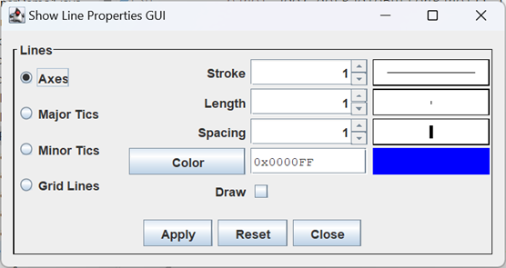
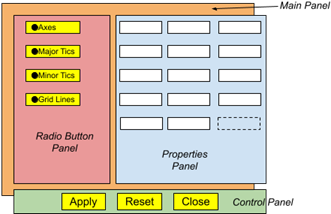
In overall appearance, our GUI is divided into three pieces: a left side, a right side and, at the bottom, a control panel. The left side consists of radio buttons, one for each category of lines. The right side contains components that control the values of the five properties associated with each category. The control panel manages the high-level functions: apply the changes, reset all properties to their original values, and close the dialog containing the panel. The properties on the right will always reflect the selected category on the left; when a different category is selected, the values of the components on the right will change. When the panel is first displayed the values of the properties for each category will reflect the current values maintained by the PropertyManager. Changes to a property will not be saved until the operator presses the Apply button. When the Apply button is pushed, all properties for all categories will be updated in the PropertyManager. If the Reset button is pressed, pending changes are discarded, and all values for all categories are reset to the current values maintained by the PropertyManager. If the dialog containing the panel is closed without applying changes, the pending changes will be reflected in the GUI when the dialog is reopened.
Finally, when the Close button is pushed, the JDialog containing the panel will be closed; if the panel has no JDialog ancestor, pushing the Close button will have no effect.
You can experiment with the operation of the panel by executing application ShowLinePropertiesPanel in the project sandbox.
Designing the LinePropertiesPanel
◼ The Supplier<LinePropertySet> Map
There will be places in our code where will need to create a specific subclass of LinePropertySet, for example LinePropertySetGridLines. To facilitate this we will have a map of Strings to Suppliers. The key will be the text on a radio button and the value will be a Supplier of the subclass of LinePropertySet that button is responsible for, for example: “Minor Tics” ➙ new LinePropertySetTicMinor()
The supplier will be expressed as a lambda, for example: () -> new LinePropertySetTicMinor()
or, equivalently, LinePropertySetTicMinor::new
The declaration of the map, then, will be: Map<String, Supplier<LinePropertySet>> typeMap
An example of its use might be: Supplier<LinePropertySet> supplier = typeMap.get( "Axes" );
LinePropertySet set = supplier.get();
An actual example of its use is in the method newRadioButton (see below).
To initialize the map we will make use of two facilities:
- Map.ofEntries( Map.Entry<K,V> … )
Method ofEntries is a static method in the Map interface. It takes a variable-length argument list of type Map.Entry<K,V>, an interface declared inside the Map interface. It produces an unmodifiable map consisting of key/value pairs corresponding to its arguments. - Map.entry(K key, V value)
Method .entry is a static method in the Map interface that produces a Map.Entry object consisting of the given key and value.
Using the above facilities, we can create and initialize our map using:
    private static final String minorTics   = "Minor Tics";
    private static final String majorTics   = "Major Tics";
    private static final String gridLines   = "Grid Lines";
    private static final String axes        = "Axes";

    Map<String, Supplier<LinePropertySet>> typeMap =
        Map.ofEntries(
            Map.entry( minorTics, LinePropertySetTicMinor::new ),
            Map.entry( majorTics, LinePropertySetTicMajor::new ),
            Map.entry( gridLines, LinePropertySetGridLines::new ),
            Map.entry( axes, LinePropertySetAxes::new)
        );
◼ Fields
The LinePropertiesPanel class will be a subclass of JPanel, and will have a handful of fields, described below.
1 2 3 4 5 6 7 8 9 10 11 12 13 14 15 16 17 18 19 20 21 22 | public class LinePropertiesPanel extends JPanel { private static final String minorTics = "Minor Tics"; private static final String majorTics = "Major Tics"; private static final String gridLines = "Grid Lines"; private static final String axes = "Axes"; private static final Map<String, Supplier<LinePropertySet>> typeMap = Map.ofEntries( Map.entry( minorTics, LinePropertySetTicMinor::new ), Map.entry( majorTics, LinePropertySetTicMajor::new ), Map.entry( gridLines, LinePropertySetGridLines::new ), Map.entry( axes, LinePropertySetAxes::new) ); private static final int margin = 10; private final PButtonGroup<LinePropertySet> buttonGroup = new PButtonGroup<>(); // ... } |
- Lines 3-6: The text to display on the radio buttons on the left side of the panel (see below).
- Lines 8-15: This is our String ➙ Supplier<LinePropertySet> map (see above).
- Line 17: The size of the empty margin to use on the main panel.
- Lines 19,20: Button group for managing our radio buttons.
◼ The Root Panel
The root of the LinePropertiesPanel is a JPanel with a BorderLayout. The root is divided into a main panel in the center of the border layout and a control panel at the bottom (SOUTH) of the border layout. The main panel is further divided into a radio button panel on the left, and a properties panel on the right. The border of the root panel is an aggregate of four pieces:
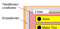
- A LineBorder;
- A TitledBorder integrated with the LineBorder;
- An EmptyBorder; and
- A CompoundBorder with the EmptyBorder on the outside, and the TitledBorder on the inside.
The code from the constructor that configures the root panel looks like this:
    super( new BorderLayout() );
    Border  lineBorder      =
        BorderFactory.createLineBorder( Color.BLACK, 1 );
    Border  titledBorder    =
        BorderFactory.createTitledBorder( lineBorder, "Lines" );
    Border  emptyBorder     =
        BorderFactory.createEmptyBorder(
            margin,
            margin,
            margin,
            margin
        );
    Border  border          =
        BorderFactory.createCompoundBorder(
            emptyBorder,
            titledBorder
        );
    setBorder( border );

    add( getMainPanel(), BorderLayout.CENTER );
    add( getControlPanel(), BorderLayout.SOUTH );
◼The Main Panel
The main panel consists of two additional panels laid out horizontally, the radio button panel and the properties panel. Here’s the code that accomplishes this.
private JPanel getMainPanel()
{
    JPanel      panel   = new JPanel();
    BoxLayout   layout  = new BoxLayout( panel, BoxLayout.X_AXIS );
    Component horSpace  =
        Box.createRigidArea( new Dimension( 25, 0 ) );

    panel.setLayout( layout );
    panel.add( getRadioButtonPanel() );
    panel.add( horSpace );
    panel.add( new PropertiesPanel() );
    return panel;
}
◼The Radio Button Panel
The radio button panel consists of four PRadioButton<LinePropertySet> components in a GridLayout of four rows and one column. We have one major method and a helper method that does this:
private JPanel getRadioButtonPanel()
{
    JPanel  panel   = new JPanel( new GridLayout( 4, 1 ) );
    Stream.of( axes, majorTics, minorTics, gridLines )
        .map( this::newRadioButton )
        .peek( panel::add )
        .forEach( buttonGroup::add );
    return panel;
}
private PRadioButton<LinePropertySet> newRadioButton( String label )
{
    LinePropertySet                 set     =
        typeMap.get( label ).get();
    PRadioButton<LinePropertySet>   button  =
        new PRadioButton<>( set, label );
    return button;
}
◼ The Control Panel
This panel contains the Apply, Reset and Close buttons. This is just a JPanel with a FlowLayout and an EmptyBorder with a top setting of 10 pixels, and 0 for all the other settings. Each button has an ActionListener, the details of which will be discussed on the next page. Here’s the code:
private JPanel getControlPanel()
{
    JPanel  panel   = new JPanel();
    Border  border  = BorderFactory.createEmptyBorder( 10, 0, 0, 0 );
    panel.setBorder( border );

    JButton applyButton = new JButton( "Apply" );
    JButton resetButton = new JButton( "Reset" );
    JButton closeButton = new JButton( "Close" );
    panel.add( applyButton );
    panel.add( resetButton );
    panel.add( closeButton );

    applyButton.addActionListener( this::applyAction );
    resetButton.addActionListener( this::resetAction );
    closeButton.addActionListener( this::closeAction );

    return panel;
}
private void applyAction( ActionEvent evt )
{
    // ...
}
private void resetAction( ActionEvent evt )
{
    // ...
}
private void closeAction( ActionEvent evt )
{
    // ...
}
◼ The Properties Panel
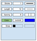
The properties panel has a GridLayout of five rows and 3 columns. The first three rows follow the pattern:
Descriptive
Label
Number
Spinner
Feedback
Component
The fourth row consists of components borrowed from the color editor: JButton, JTextField, JLabel. The fifth row has a JLabel (Draw), a JCheckBox and a JLabel with no text. The code is contained in the inner class PropertiesPanel. Here is an annotated list of the fields for this class.
1 2 3 4 5 6 7 8 9 10 11 12 13 14 15 16 17 18 19 20 21 22 23 24 25 26 27 28 29 30 31 32 33 34 35 36 37 38 39 40 41 42 43 44 45 46 47 48 49 50 51 52 53 | private class PropertiesPanel extends JPanel implements ItemListener { private static final float defVal = 1.0f; private static final float defMin = 0.0f; private static final float defMax = 500.0f; private static final float defStep = .1f; private static final String strokeText = "Stroke"; private static final String lengthText = "Length"; private static final String spacingText = "Spacing"; private static final String drawText = "Draw"; private final JLabel strokeLabel = new JLabel( strokeText, SwingConstants.RIGHT ); private final SpinnerNumberModel strokeModel = new SpinnerNumberModel( defVal, defMin, defMax, defStep ); private final JSpinner strokeSpinner = new JSpinner( strokeModel ); private final StrokeFeedback strokeFB = new StrokeFeedback( () -> doubleValue( strokeModel ) ); private final JLabel lengthLabel = new JLabel( lengthText, SwingConstants.RIGHT ); private final SpinnerNumberModel lengthModel = new SpinnerNumberModel( defVal, defMin, defMax, defStep ); private final JSpinner lengthSpinner = new JSpinner( lengthModel ); private final LengthFeedback lengthFB = new LengthFeedback( () -> doubleValue( lengthModel ) ); private final JLabel spacingLabel = new JLabel( spacingText, SwingConstants.RIGHT ); private final SpinnerNumberModel spacingModel = new SpinnerNumberModel( defVal, defMin, defMax, defStep ); private final JSpinner spacingSpinner = new JSpinner( spacingModel ); private final SpacingFeedback spacingFB = new SpacingFeedback( () -> doubleValue( spacingModel ) ); private final ColorEditor colorEditor = new ColorEditor(); private final JButton colorButton = colorEditor.getColorButton(); private final JTextField colorField = colorEditor.getTextEditor(); private final JComponent colorFB = colorEditor.getFeedback(); private final JLabel drawLabel = new JLabel( drawText, SwingConstants.RIGHT ); private final JCheckBox drawToggle = new JCheckBox(); // ... } |
- Line 1: This class is an inner class of LinePropertiesPanel. Recall that this means PropertiesPanel can only be instantiated in the context of an instance of LinePropertiesPanel, and has access to all members of the LinePropertiesPanel instance.
- Line 2: LinePropertiesPanel implements the ItemListener interface, which it will use to listen for selection events issued by the toggle buttons in the radio button panel. This means that it needs an itemStateChanged(ItemEvent) method.
- Lines 4-7: Default values for initializing the spinners in this panel.
- Lines 9-12: Text for the labels in the first column of four of the rows in the GridLayout.
- Lines 14-20: Components to occupy the first row of the GridLayout:
- Lines 14,15: The descriptive label that goes in the first column of the row. Note that its text is right-justified.
- Lines 16,17: The SpinnerNumberModel to be incorporated in the spinner that occupies column 2.
- Lines 18,19: The spinner that occupies column 2.
- Lines 20,21: The feedback component that occupies column 3.
- Lines 23-30: Components to occupy the second row of the GridLayout.
- Lines 32-39: Components to occupy the third row of the GridLayout.
- Line 41: The color editor to manage line color.
- Lines 42-47: Components to occupy the fourth row of the GridLayout. Note that they are all supplied by the ColorEditor (line 41).
- Lines 49-51: The label and check box to occupy the first two columns of the fifth row of the GridLayout. (The third column will be occupied by a blank JLabel generated by the constructor.)
All initialization of an instance of the PropertiesPanel class is performed by the constructor. The code and annotations for the constructor follow. Since this page is all about assembling the LinePropertiesPanel we will defer a detailed discussion of the event listeners to the next page.
1 2 3 4 5 6 7 8 9 10 11 12 13 14 15 16 17 18 19 20 21 22 23 24 25 26 27 28 29 30 31 32 33 | public PropertiesPanel() { super( new GridLayout( 5, 3, 5, 3 ) ); if ( buttonGroup.getButtonCount() < 1 ) throw new ComponentException( "no radio buttons found" ); add( strokeLabel ); add( strokeSpinner ); add( strokeFB ); strokeSpinner.addChangeListener( e -> strokeFB.repaint() ); add( lengthLabel ); add( lengthSpinner ); add( lengthFB ); lengthSpinner.addChangeListener( e -> lengthFB.repaint() ); add( spacingLabel ); add( spacingSpinner ); add( spacingFB ); spacingSpinner.addChangeListener( e -> spacingFB.repaint() ); add( colorButton ); add( colorField ); add( colorFB ); add( drawLabel ); add( drawToggle ); add( new JLabel() ); // placeholder buttonGroup.getButtons() .forEach( b -> b.addItemListener( this ) ); } |
- Line 3: Instantiates this PropertiesPanel with a GridLayout via the superclass’s JPanel(LayoutManager) constructor. The first “5,3” passed to the GridLayout constructor configures “five rows of three columns each”; the second “5,3” configures the horizontal and vertical gaps between columns/rows.
- Lines 5,6: Sanity check: the constructor relies on the buttons in the radio button panel having been created before it is invoked.
- Lines 8-11: Configures the first row of the GridLayout.
- Lines 13-16: Configures the second row of the GridLayout.
- Lines 18-21: Configures the third row of the GridLayout.
- Lines 23-25: Configures the fourth row of the GridLayout.
- Lines 27-29: Configures the fifth row of the GridLayout.
- Lines 31,32: Adds this PropertiesPanel as an ItemListener to each radio button.
◼ Helper Methods
The PropertiesPanel class has several methods for the purpose of synchronizing values between the radio buttons on the left of the panel, and the management components on the right. I’ll list them here, but defer the details to the next page of the lesson.
- itemStateChanged(ItemEvent)
Method required by the ItemListener interface (see PropertiesPanel notes, above). - doubleValue(SpinnerNumberModel), floatValue(SpinnerNumberModel)
Simple methods for extracting Double and Float values from a given SpinnerNumberModel. - copyLeft(LinePropertySet)
Method to copy the component values from the right side of the panel to a given LinePropertySet. It’s named Left because the LinePropertySet will typically belong to a radio button from the left side of the panel. - copyRight(LinePropertySet)
Method to initialize the components on the right side of the panel from values in a given LinePropertySet.
Summary
On this page we developed the code to assemble the LinePropertiesPanel, but eliminated any discussion of the event processing logic. On the next page we’ll add the event processing logic, completing the development of the LinePropertiesPanel.