Borders are decorations drawn at the edges of a component to improve its appearance, set it apart from nearby components, or visually group components together. The javax.swing.border package provides a variety borders that can be configured for these purposes. We’ll be looking at these:
- EmptyBorder;
- LineBorder;
- BevelBorder;
- EtchedBorder;
- TitledBorder; and
- CompoundBorder
Note: Unless otherwise stated, all the figures below were generated by application BorderDemo1 in the project sandbox.
We’ll begin by looking at a Swing utility class that can create and manage borders.
See also:
- How to Use Borders in the Oracle Java Tutorial
- In the Java API Documentation:
GitHub repository: Cartesian Plane Part 15
Previous lesson: Cartesian Plane Lesson 15 Page 2: Layout Managers
The BorderFactory Class

Any of the borders in the Swing border package can be created and configured by instantiating an object of that class. However, each can also be obtained from the utility class BorderFactory. Why would you want to use BorderFactory? Consider the border on, for example, a JButton. Now consider how many buttons there are in a GUI. Every button has a border that looks like the border on every other button. BorderFactory caches and reuses a border whenever it can; so instead of every button having its own Border object, they can all share a single instance. In this project we will always use BorderFactory to create a border.
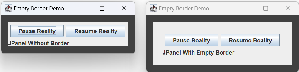
Empty Borders
An empty border is invisible. It occupies space, but you can’t see it. Giving a component an empty border is like giving it a margin. Create an empty border by giving it the width of the border on each side of the component, for example:
JPanel panel  = new JPanel();
Border border = BorderFactory.createEmptyBorder(
    20, // top width, pixels
    20, // left width, pixels
    20, // bottom width, pixels
    20  // right width, pixels
 );
Line Borders
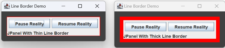
A line border is just a line drawn around a component. You can control the width and color of the line. In the BorderFactory class, see:
createLineBorder(Color color)createLineBorder(Color color, int thickness)createLineBorder(Color color, int thickness, boolean rounded)
Bevel Borders
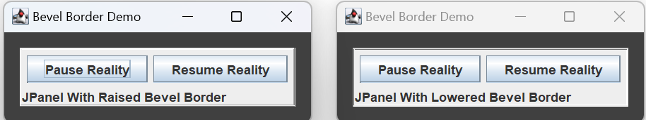
BevelBorders use contrasting colors to simulate shadows, giving a component a 3D appearance. They come in two flavors: a raised bevel border makes a component appear to pop-out from the screen; a lowered bevel border makes a component appear to sink into the screen. When instantiating a new border, the constructor determines whether the border is raised or lowered:
    new BevelBorder( BevelBorder.RAISED );
    new BevelBorder( BevelBorder.LOWERED );
The BorderFactory utility class gives you a wealth of options:
BorderFactory.createBevelBorder( BevelBorder.RAISED )
Creates a raised bevel border.BorderFactory.createRaisedBevelBorder()
Creates a raised bevel border.BorderFactory.createBevelBorder( BevelBorder.LOWERED )
Creates a lowered bevel border.BorderFactory.createLoweredBevelBorder();
Creates a lowered bevel border.
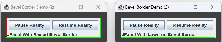
Constructor and utility method overloads also gives you control over the colors used to create the shadows. In the BarderFactory class, see:
createBevelBorder(int type, Color highlight, Color shadow)createBevelBorder(int type, Color highlightOuter, Color highlightInner, Color shadowOuter, Color shadowInner)
Etched Borders
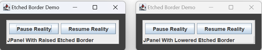
Like bevel borders, etched borders give components a 3D appearance, and can be raised or lowered. The sample etched demos displayed by BorderDemo1 were created using: BorderFactory.createEtchedBorder( EtchedBorder.RAISED );
BorderFactory.createEtchedBorder( EtchedBorder.LOWERED );
Also like bevel borders, constructor and utility method overloads give you control over the colors used to create the shadows. In the BorderFactory class, see:
createEtchedBorder(int type, Color highlight, Color shadow)
Titled Borders
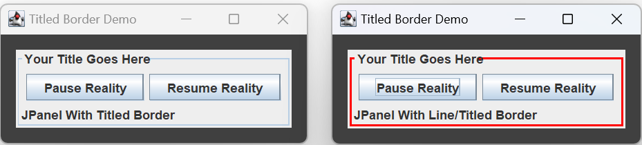
A TitledBorder consists of a base border with text superimposed on top of it. The default base border is a 1 pixel line border. The figure on the left, above, was generated using: BorderFactory.createTitledBorder( "Your Title Goes Here" );
You can control the base border by specifying it yourself. The figure on the right, above, was generated using: Border line = BorderFactory.createLineBorder( Color.RED, 2 ); BorderFactory.createTitledBorder( line, "Your Title Goes Here" );

You can also control the font, color, justification and position of your title. The above figures were generated using:
Border  bevel   = BorderFactory.createRaisedBevelBorder();
Border  border1 =
    BorderFactory.createTitledBorder(
        bevel,
        "Your Title Goes Here",
        TitledBorder.DEFAULT_JUSTIFICATION,
        TitledBorder.ABOVE_BOTTOM
    );

Border  etched  =
    BorderFactory.createEtchedBorder( EtchedBorder.RAISED );
Border  border2 =
    BorderFactory.createTitledBorder(
        etched,
        "Your Title Goes Here",
        TitledBorder.DEFAULT_JUSTIFICATION,
        TitledBorder.BOTTOM
    );
See also the BorderFactory class methods:
createTitledBorder(Border border, String title, int titleJustification, int titlePosition, Font titleFont)createTitledBorder(Border border, String title, int titleJustification, int titlePosition, Font titleFont, Color titleColor)
Compound Borders
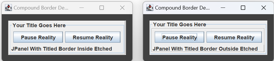
A compound border consists of two borders, one drawn inside the other. Create a compound border using the BorderFactory method createCompoundBorder(BorderoutsideBorder, Border insideBorder). The above figures were generated using the following:
Border  etched  = BorderFactory.createEtchedBorder();
Border  titled  =
    BorderFactory.createTitledBorder( "Your Title Goes Here" );
Border  border1 =
    BorderFactory.createCompoundBorder( etched, titled );
Border  border2 =
    BorderFactory.createCompoundBorder( titled, etched );
If you want to get fancy, you can always make, say, two compound borders, then make a third compound border out of the first two.