Buttons are some of the most useful components in Swing. They can represent values, as when a toggle button is given the value true or false. A push button is often used to launch an operation such as: committing a data base change, exiting the application or indicating “Yes, I’m sure.” In this lesson we’ll be looking at these components:
- AbstractButton;
- JButton;
- JToggleButton; and
- JCheckBox
See also:
- How to Use Buttons, Check Boxes, and Radio Buttons in the Oracle Java Tutorial
GitHub repository: Cartesian Plane Part 15
Previous lesson: Cartesian Plane Lesson 15 Page 3: Borders
Buttons
Let’s start by examining the button class hierarchy. Then we’ll look at configuration and interaction options for the components cited above.
■ Button Class Hierarchy
The class hierarchy for buttons in Swing looks like this:
+ …
+ JComponent
+ AbstractButton
+ JButton
+ JToggleButton
+ JCheckBox
+ JRadioButton
+ JMenuItem
+ …
Right now we’re going to talk about AbstractButton, JButton, JToggleButton and JCheckBox. We’ll leave JRadionButton, and JMenuItem and its subclasses for a later time.
■ The AbstractButton, JButton, ButtonModel Classes;
■ The ButtonModel Interface
Every button that inherits from AbstractButton has a ButtonModel. As controlled by the ButtonModel, a button can occupy any of the following states:
- Enabled: determines whether the button can utilized by the operator; you can only interact with a button if it is enabled.
- Selected: indicates whether or not a button is selected. Note that this property is not relevant to every type of button; it doesn’t make sense for example, to designate a JButton as selected. For JToggleButtons, however, this property determines the value of the button (true or false).
- Rollover: the mouse cursor is sitting on the button (the mouse has rolled-over the button).
- Pressed: a button has been pressed, typically using the mouse, but not yet released.
- Armed: a button enters this state immediately before being activated. Typically, a button is armed if Rollover and Pressed are true.
- Triggered: a button has been pressed and released. This state can be reached using the mouse, the button’s doClick() method, and some keyboard actions, notably pressing and releasing the space bar.
Another property of buttons (and many other JComponents) is focus:
- Focus: a component with the focus (also called keyboard focus) will be the first recipient of any event originating with the keyboard.
Major events associated with buttons are:
- ActionEvent: these events are delivered to ActionListeners every time a button is triggered. This is the kind of event that we are most interested in.
- ItemEvent: these are delivered to ItemListeners every time a button is selected or deselected. Since JButtons can’t usually be selected or deselected, these events are most commonly associated with JToggleButton and its subclasses.
- ChangeEvent: these events are delivered to ChangeListeners every time the state of the button changes, where state is one of enabled, selected, rollover, armed or pressed.
Note the distinction between action event and item event:
- An item event is issued every time a button is selected or deselected by a) clicking on it; b) simulating a click via certain keyboard actions; c) simulating a click by calling AbstractButton.doClick(); or d) calling AbstractButton.setSelected(boolean).
- An action event is issued every time a button is triggered. Important note: calling AbstractButton.setSelected(boolean) will not generate an action event..
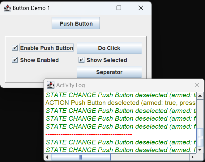
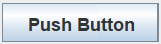
You can get a look at the state changes and events by running application ButtonDemo1 from the project sandbox. This application detects and logs events associated with operator interaction. Start the application, and move your mouse over the component labeled Push Button (but don’t press it). The activity log will show that a ChangeEvent was issued for the push button. When the event was issued, we see that the state of the button is deselected with properties armed: false, pressed: false, rollover: true and enabled: true. It also indicates focus: false. You will see that the visual state of the button has changed to indicate rollover:
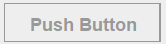
Note: for the rest of the discussion of JButtons I will eliminate references to the enabled or selected states. A JButton is always going to be deselected, and it will be clear from the display if it is not enabled. For convenience, you can turn off reporting for these states in the demo application GUI.
Now press, but don’t release, your mouse. The activity log should show that two ChangeEvents were issued, one indicating that armed has changed to true, and the other telling you that pressed was changed to true. The appearance of the button also changes to indicate that it is armed and pressed.
Keeping your mouse button pressed, move the cursor off the button. You’ll get another ChangeEvent, and when you examine the button’s properties you should see that it is pressed but not armed: armed: false, pressed: true, rollover: false. You should also see that the button now has focus. As noted above, focus is not supervised by ButtonModel, and you don’t get a ChangeEvent when it changes.
Note: if you want to get focus events, see the interface WindowFocusListener, and method addWindowFocusListener() in the Window class.
To quickly recap, we have moved the mouse cursor onto the button, pressed the mouse button, and move the mouse off the button (with the mouse still pressed) and our status is armed: false, pressed: true, rollover: false, has focus: true. If you release the mouse button now, while the push button is not armed, you will not trigger an action event, but you will get a change event indicating that the button is no longer pressed. So now the button is not armed and not pressed but it still has focus. If you look carefully at the button, you will see that this is reflected in the visual state of the button.
To see why focus is important, try this in the demo application:
- Click the Separator button. This puts a separator in the activity log. If you look closely at the Separator button you will see that it has focus.
- Now, without pressing any mouse buttons, move your mouse over the Push Button button. The activity log should now indicated that the window has status armed: false, pressed: false, rollover: true, has focus: false, the most important of these being has focus: false.
- Next press the space bar (if a button has focus, pressing the space bar will trigger it). Note that the Separator button is triggered, not the Push Button.
While we still have ButtonDemo1 open, click the Do Click button; this will invoke the doClick() method on Push Button. As we see, this gives us a pretty good simulation of clicking on the button; it results in five events being issued:
- STATE CHANGE armed: true
Push Button (armed: true, pressed: false, rollover: false, has focus: false) - STATE CHANGE pressed: true
Push Button (armed: true, pressed: true, rollover: false, has focus: false) - ACTION
Push Button (armed: true, pressed: false, rollover: false, has focus: false) - STATE CHANGE: pressed: false
Push Button (armed: true, pressed: false, rollover: false, has focus: false) - STATE CHANGE armed: false
Push Button (armed: false, pressed: false, rollover: false, has focus: false)
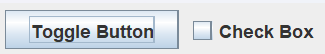
■ The JToggleButton, JCheckBox Classes
A toggle button is a component that can be true or false. Or, synonymous with true or false:
- selected or deselected;
- set or reset.
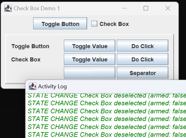
JToggleButton is the Swing implementation of a toggle button. The JToggleButton itself is not often used; more commonly used are its subclasses, JCheckBox and JRadioButton. You can see a check box in the figure above; we’ll get to radio buttons later. Toggle buttons support the same states and events as any other subclasses of AbstractButton. You can experiment with this by running JCheckBoxDemo1 in the project sandbox. In this application, if you click on the check box, or call doClick on the check box, the value of the button changes and you get both an action event and an item event. You can also change the value of the button using the Toggle Value button; this will change the value of the button by calling AbstractButton.setSelected(boolean). As noted above, this will generate an item event, but not an action event.
Note: at least on my development computer (JDK 17 on Microsoft Windows), rolling over the JCheckBox generates a rollover state change event; rolling over the raw JToggleButton does not.
Digression: Buttons with Images
We are not going to be putting images on our buttons in this project, but, in case you’re interested in doing so, here is a quick discussion of how to do it.
To add an image
to a component,
first it has to be
formatted as an icon.
The quickest way
to do this
is to use
the ImageIcon(String path) constructor,
where path is the path
to an image file
in any of the common formats:
ImageIcon icon = new ImageIcon( “images/Forward.png” );
However, this constructor
won’t tell us
whether or not
the image indicated by the path
was found
and correctly loaded.
I prefer to create a BufferedImage first,
then use that to create the icon.
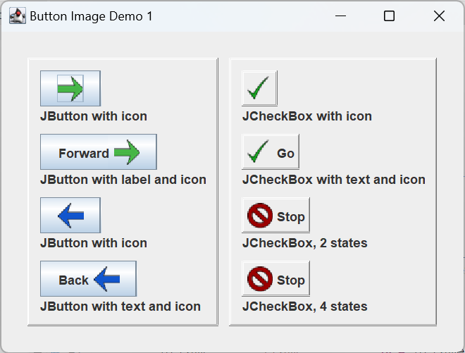
The GUI pictured at right
was created using
application ButtonImageDemo1
in the project sandbox;
the icons in the GUI
were formulated using:
private ImageIcon getImageIcon( String path )
{
    File        file    = new File( path );
    ImageIcon   icon    = null;
    try
    {
        BufferedImage   image   = ImageIO.read( file );
        icon = new ImageIcon( image );
    }
    catch ( IOException exc )
    {
        exc.printStackTrace();
        System.exit( 1 );
    }
    return icon;
}
If ImageIO.read fails it will throw an IOException which we can then catch.
To add an image
to a JButton,
you can use one of the constructors:
JButton( Icon image )
JButton( String text, Icon image )
You can always set the image and/or text after instantiation using:
AbstractButton.setText( String text )
AbstractButton.setImage( Icon image )
When using text and an image, by default the text is placed to the right of the image. To place the text on the left, use JButton.setHorizontalTextPosition( SwingConstants.LEFT ). To configure the space between text and image, use JButton.setIconTextGap( int pixels ). To create the GUI pictued above, I used a helper method to consistently configure JButtons with both text and labels:
  ImageIcon fwdIcon    = getImageIcon( "images/Forward.png" );
  JButton   fwdButton2 = getLabeledButton( "Forward", fwdIcon );
    ...
private JButton getLabeledButton( String label, Icon icon )
{
    JButton button  = new JButton( label, icon );
    button.setHorizontalTextPosition( SwingConstants.LEFT );
    button.setIconTextGap( 5 );
    return button;
}
When using images on toggle Buttons you can use one image for the deselected state and another for the selected state. To set the default image in a constructor, use CheckBox( Icon image ); the given image will always be used for a button in the deselected state, and, unless otherwise configured, will also use it for the selected state. To configure an image for a button in the selected state, use AbstractedButton.setSelectedIcon( Icon image ). To set the default image after instantiation, use AbstractedButton.setIcon( Icon image ). To create the first three check boxes in the accompanying figure I used the following helper method:
   ImageIcon goIcon    = getImageIcon( "images/Go.png" );
   ImageIcon goIconSel = getImageIcon( "images/GoSelected.png" );
   JCheckBox checkBox2 = getCheckBox( "Go", goIcon, goIconSel );
    ...
private JCheckBox getCheckBox(
    String text,
    ImageIcon icon,
    ImageIcon selectedIcon
)
{
    Border bevelBorder =
        BorderFactory.createBevelBorder( BevelBorder.RAISED );
    Border emptyBorder =
        BorderFactory.createEmptyBorder( 3, 3, 3, 3 );
    Border border      =
        BorderFactory.createCompoundBorder(
            bevelBorder,
            emptyBorder
        );

    JCheckBox   checkBox    = new JCheckBox( icon );
    checkBox.setSelectedIcon( selectedIcon );
    checkBox.setText( text );
    checkBox.setBorder( border );
    checkBox.setBorderPainted( true );

    return checkBox;
}
Note: By default, JTextBoxes don’t draw their borders even if you set one. To force a JTextBox to draw its Border use AbstractButton.setBorderPainted( boolean paint ).
You can also set images to be used for a button’s roll-over and pressed states. The last check box in the above GUI was configured using:
ImageIcon stopIcon   = getImageIcon( "images/Stop.png" );
ImageIcon stopIconRO = getImageIcon( "images/StopRollover.png" );
ImageIcon goIcon     = getImageIcon( "images/Go.png" );
ImageIcon goIconSel  = getImageIcon( "images/GoSelected.png" );

JCheckBox checkBox4  =
    getCheckBox( "Stop", stopIcon, "Go", goIconSel );
panel.add( checkBox4 );
checkBox4.setRolloverIcon( stopIconRO );
checkBox4.setPressedIcon( goIcon );
There are two more image options for buttons (not shown in the sample GUI); see AbstractButton.setDisabledIcon(Icon icon) and AbstractButton.setDisabledSelectedIcon(Icon icon).